
Workload Migration Platform Case Study
System for database management and server migrations
Overview
Our client was developing a refreshed version of a server migration management application. In order to be more transparent and user-friendly than what was available in the outdated edition, he needed a layout to be redesigned completely.
Overview

The business needs
The interface of previous system was confusing, which reduced work efficiency. The poor design made the app unintuitive and unreadable. Difficult user experience was also caused by fact that the solution was constantly being developed with new functionality, further complicating its UI.
The goal was therefore to prevent the mistakes of the former release. The new layout was meant to include space for application development.
Our Challenge
The key challenge was to lay out the appearance of the application. Its backend was very complex. The solution had many functions related to migration management, including: entering raw data, processing it, packaging it into migration groups, setting migration deadlines, and turning manual activities into tasks. To create the most efficient and user-friendly design, we needed to understand all the processes to decide which functions are essential and which can be hidden from the user’s eye, as they are unnecessary for the operation of the application.
Our approach to the process
We worked in design sprints as part of agile methodology, which was consistent of 7 phases.
Discovery
We began by research and analysis for the project, so we could get the most out of the business need. Data that we were backing up on, were collected from business analysts, as well as from our meetings with stakeholders’ clients.
Planning & Ideation
With all gathered information, we started preparing a plan and sub deadlines.
Ideation phase was the first one of the looping steps, during which we have created first sketches on how the visualizations should reflect the requirements.
Design
At this point, we prepared the first mockups and lo-fi wireframes. It was another circular point of the process that after the next phase we were coming back to, in order to create improved designs and finally more interactive mockups.
Feedback
We were conducting systematic workshops with stakeholders. Each meeting was aimed at creative problem-solving and verification of assumptions. The mock-ups were shown to the client, so he could have been in control of the product vision at all times.
Testing
After all the updates, we moved to the testing phase. The user experience was the most important thing for us, and the target audience was to verify if the design meets the needs of real users.
We made a few more adjustments and the app was ready for the further step.
Developing
We gave over the mockups and protocols to the development team, and we were supporting them all the way with insights they needed. We also provided feedback on the production version to make sure everything was looking exactly as we planned.
Let’s talk about how we can design your future
The result
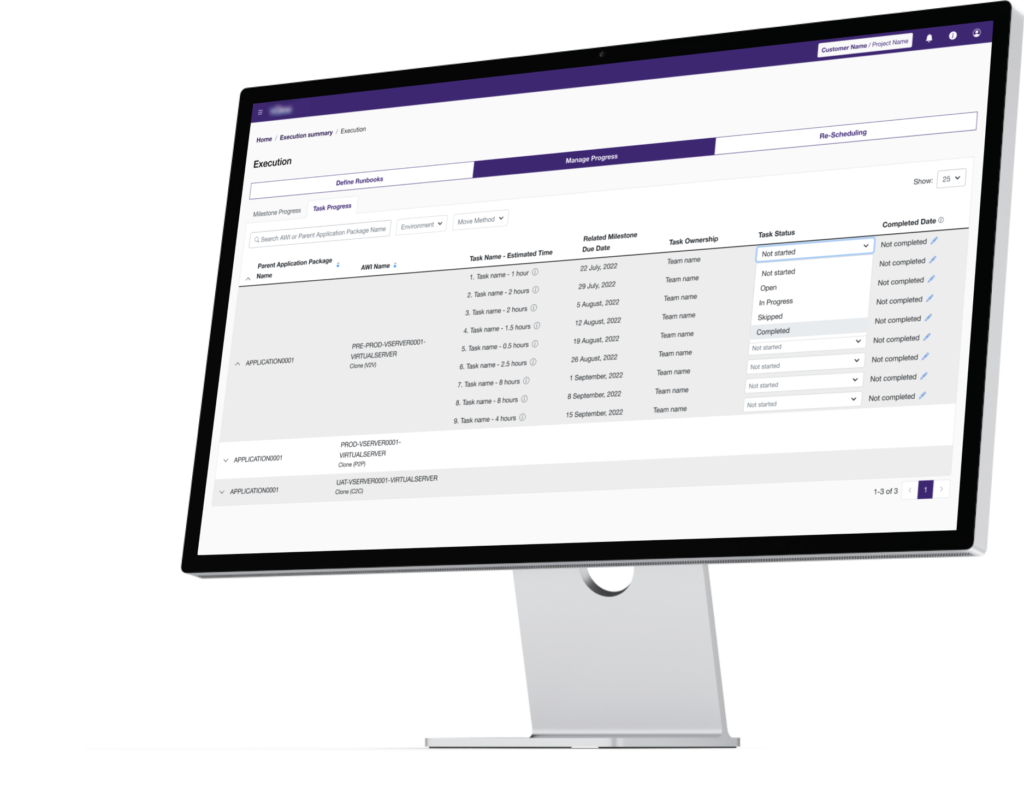
The main goal of the project was met. The application interface was modernized. We created 5 mock-ups of the modules, and the interface provided the minimum information necessary for the process (from the very extensive backend, we created a frontend that showed only useful points). The use of the App and efficiency of work increased due to simplified structure and clear design.
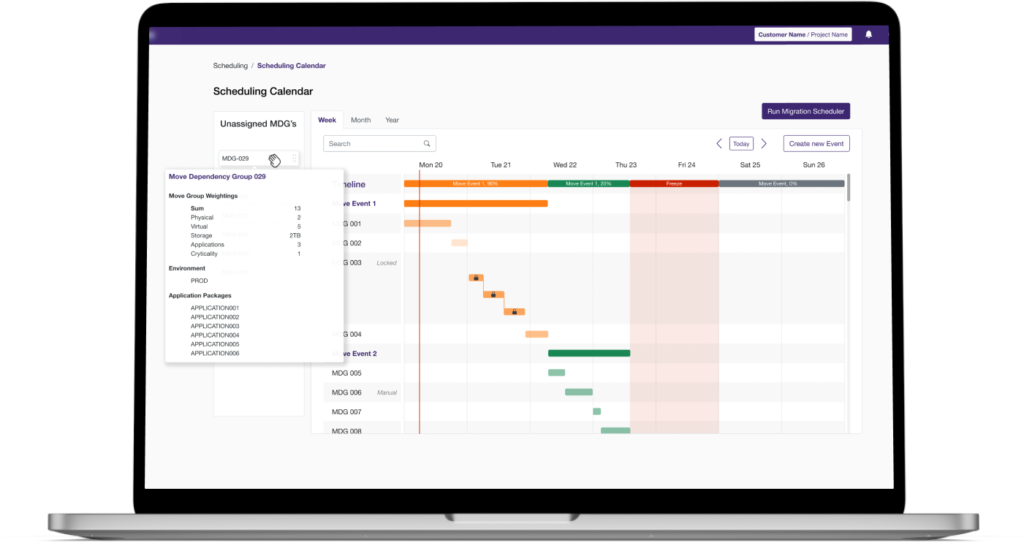
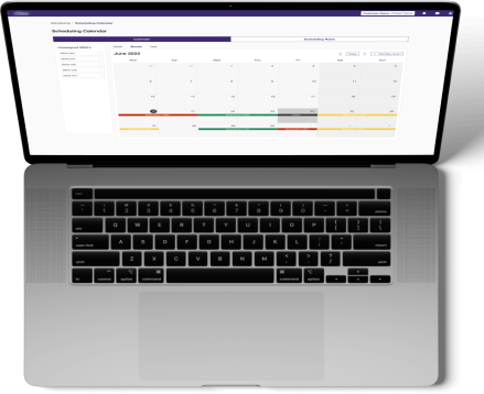
This was the 3rd version of the software, and 90% of users considered the current design better than what they had utilized so far.
Tight collaboration with business and users helped to create a product with enormous layers of UX and UI, with overall rating of the prototype on 8.5/10.
Start a project with Devapo
Not everyone pays attention to details. We do.
